
In this case study, we are going to talk about teaching website development for a teacher who was looking to design a website as she wanted. We have shared everything in this case study like what her requirements and how she wanted her website should look like and how we did the same before the deadline. So let’s dive into the case study and understand deeply about this project.
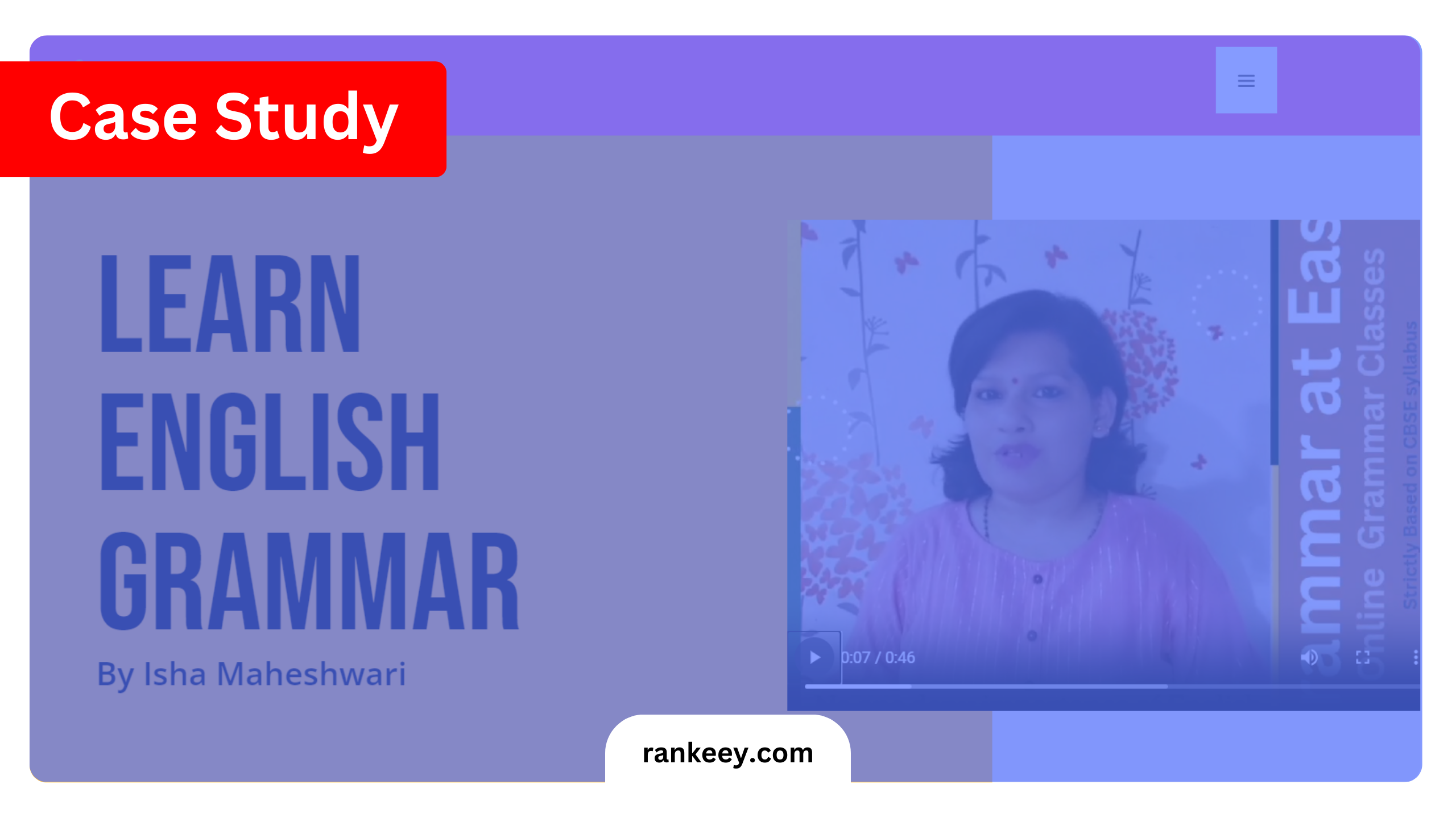
Client Requirement: Teaching Website
The project involved the website development for a teacher who specializes in online English classes for kids. The client’s main request was to create a site that appealed to children. This required using bright and cheerful colors like yellow and pink, which are known to resonate with young audiences. The website needed to be simple yet effective in communicating the services offered while encouraging engagement from both kids and their parents.
Website Structure and Design
The design of Grammaratease.com was centered around the client’s need to make the website inviting and kid-friendly. We selected WordPress as the Content Management System (CMS) due to its flexibility and ease of use, allowing us to create a customized site that met the client’s specific needs without sacrificing functionality.
Hero Section

The hero section of the website was designed to make an immediate impact. It featured:
- A welcoming video of the teacher, serving as a personal introduction to potential students and parents.
- A short text description of the teacher’s qualifications and teaching style, providing a warm and approachable first impression.
- A bright yellow and pink background that created an inviting atmosphere right from the start.
Downloadable Curriculum

Following the hero section, we added a downloadable curriculum section. This was a key part of the site’s functionality, allowing parents to easily access the course content before enrolling their children. The design was kept simple, with a clear call-to-action (CTA) button that enabled quick downloading of the curriculum.
Live Class Recordings
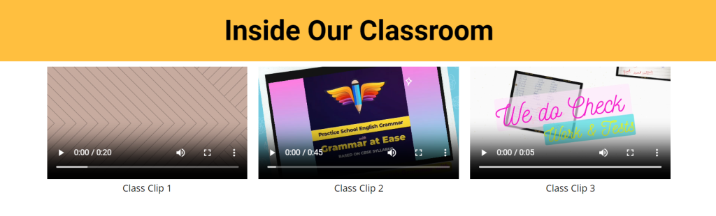
To enhance credibility and improve conversion rates, we incorporated a section featuring three videos. These videos were recordings of the client’s live classes, showcasing her teaching methods and how she interacts with students. This was particularly effective in giving parents a real sense of what to expect from the classes, thereby increasing their confidence in enrolling their children.
Learning Outcomes Section

Next, we created a section that highlighted what students would learn in the classes. On the left side, we placed an image that symbolized English learning, while on the right side, we listed the specific learning outcomes. This section was designed to be straightforward and informative, making it easy for parents to understand the value their children would gain from the classes.
Weekly Class Schedule
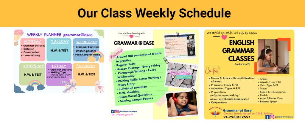
Understanding the importance of organization for parents, we added a weekly class schedule section. This section was enriched with graphics provided by the client, making it visually engaging and easy to navigate. The schedule was presented in a clear, concise manner, allowing parents to quickly find the information they needed.
Reviews Section
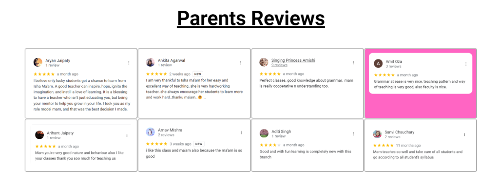
To build trust and encourage more sign-ups, we included a review section. This section displayed testimonials from parents who had previously enrolled their children in the classes. By sharing positive experiences, the reviews played a crucial role in reassuring new visitors about the quality of the teaching offered.
FAQs and Footer
The site concluded with an FAQs section, where we addressed common questions and concerns. This was strategically placed to reduce any hesitation parents might have before enrolling their children. The footer of the site was kept minimalistic, featuring only a large CTA button labeled “Enroll Now.” This clear and prominent button was designed to drive conversions by guiding visitors to the enrollment process without distractions.
Conclusion
The website development for the teacher at Grammaratease.com successfully met the client’s requirements by creating a user-friendly, visually appealing website tailored to the needs of young students and their parents. By using WordPress as the CMS and incorporating engaging colors, videos, and informative content, we were able to design a site that not only attracts but also converts visitors into students. The project highlights the importance of understanding the target audience and creating a web design that resonates with them, leading to higher engagement and enrollment rates.